
Jump ahead to


Research
What does HKPAWS want?
From an initial meeting with HKPAWS' director and marketing/community lead, as well as website auditing:
Competitive Analysis
Hong Kong animal shelters lack transparent adoption processes.
What does potential adopters want?
Through 7 User Interviews and 10 surveys , I have discovered that..
are not satisfied with the adoption process.
WHY?
" I was not informed animal’s health problems! "
" No one got back to me! "
" The cats look so dirty! "
" I wanted to know my pet’s past live like what happened and why abandoned. "
who are satisfied with their animal shelter -
BECAUSE OF…


Appearance, characteristics and background of the animal waiting for home
Potentials adopters could take a quick look of available cat and dogs’ profile and click into the detailed profile. In case of doubt, they can simply fill in the adopt/foster form and HKPAWS will match for according to their needs.

Detailed and transparent application process
When adopters and fosters are in doubt of how HKPAWS adoption or fostering work , they could check the application process for adoption or fostering on respective page - and learn more about the process.
By highlighting trail adoption will effectively increase the likelihood of adoption form submission.
Story of HKPAWS and founder of HKPAWS
By sharing more HKPAWS and founder’s stories, potential adopters (and donors) will understand the philosophy and mission of HKPAWS - which may increase the trustworthiness and credibility of HKPAWS.
Donors and partners' accreditation
Not only would donors and partners be accredited, donors and adopters would also know whom HKPAWS are cooperated and supported by, increase the trust and familiarity of HKPAWS as a brand.
The Iterations
How to improve the design with qualitative data?
Taking the bugs & issues from usability testing into consideration, actionable items have been created and several iterations were made:
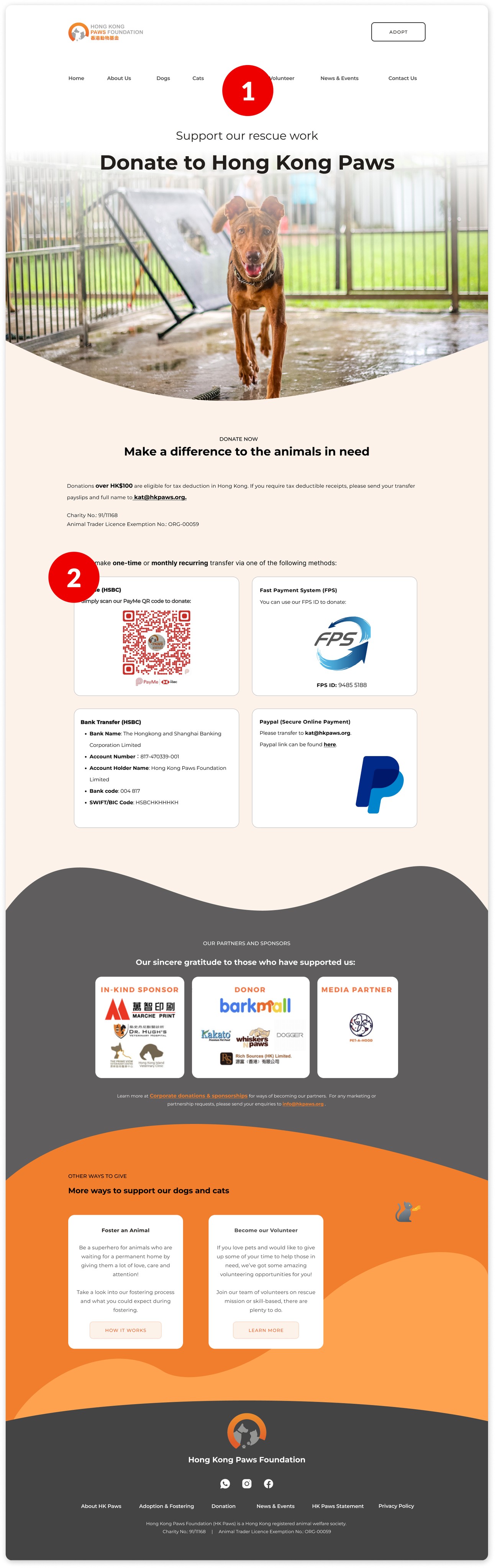
Homepage
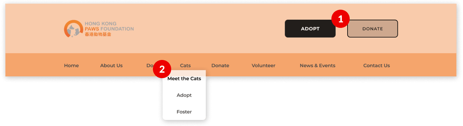
✘ Problems
Too many CTA buttons .
Adopt/foster form should be easier to be reached.
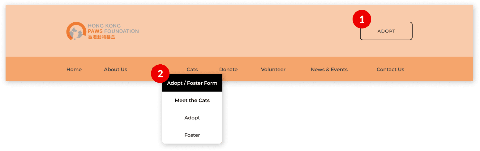
✔ Improvement Made
Removed a CTA button and prioritising adoption.
Added a adopt/foster form under Dogs and Cats for visibility and accessibility.
Before
After
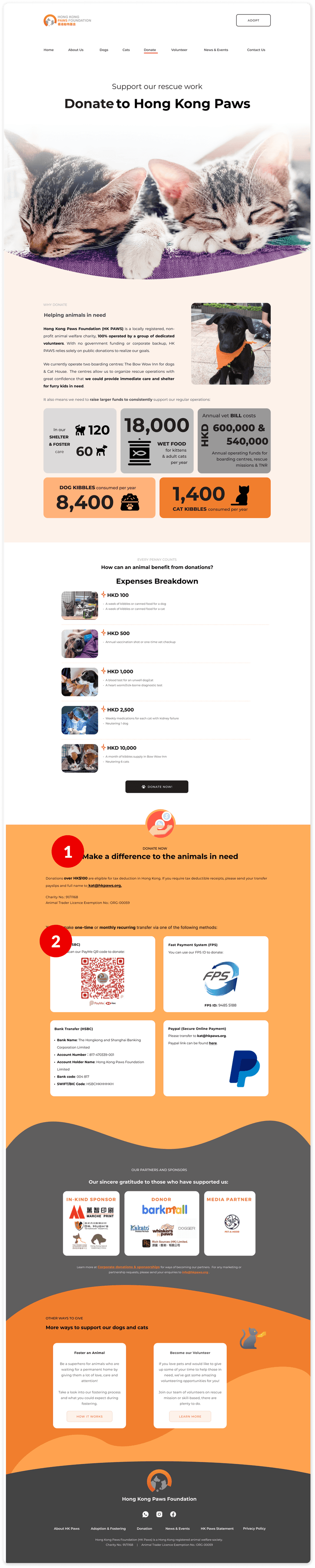
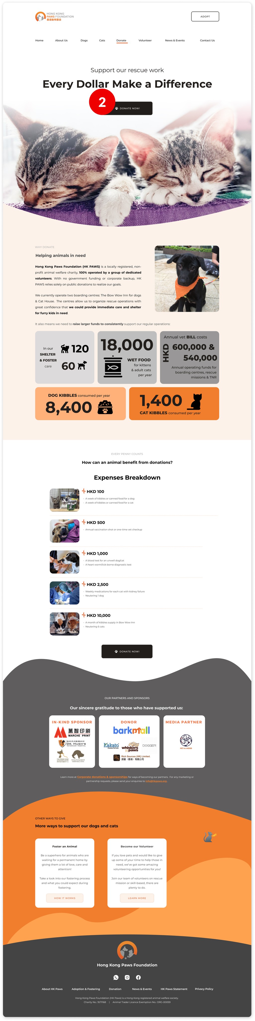
Donation Page
✘ Problems
Donation methods should be more apparent and quicker to be found.
Donation methods should be more distinct from one another.
✔ Improvement Made
Divided donate content into 2 pages: Donate Now & Why Donate.
Added Donate Now button on Why Donate hero image.
Before
After
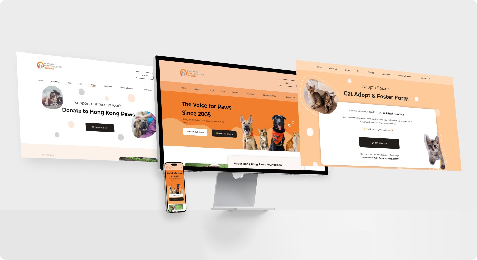
The Product
How does the MVP look like?
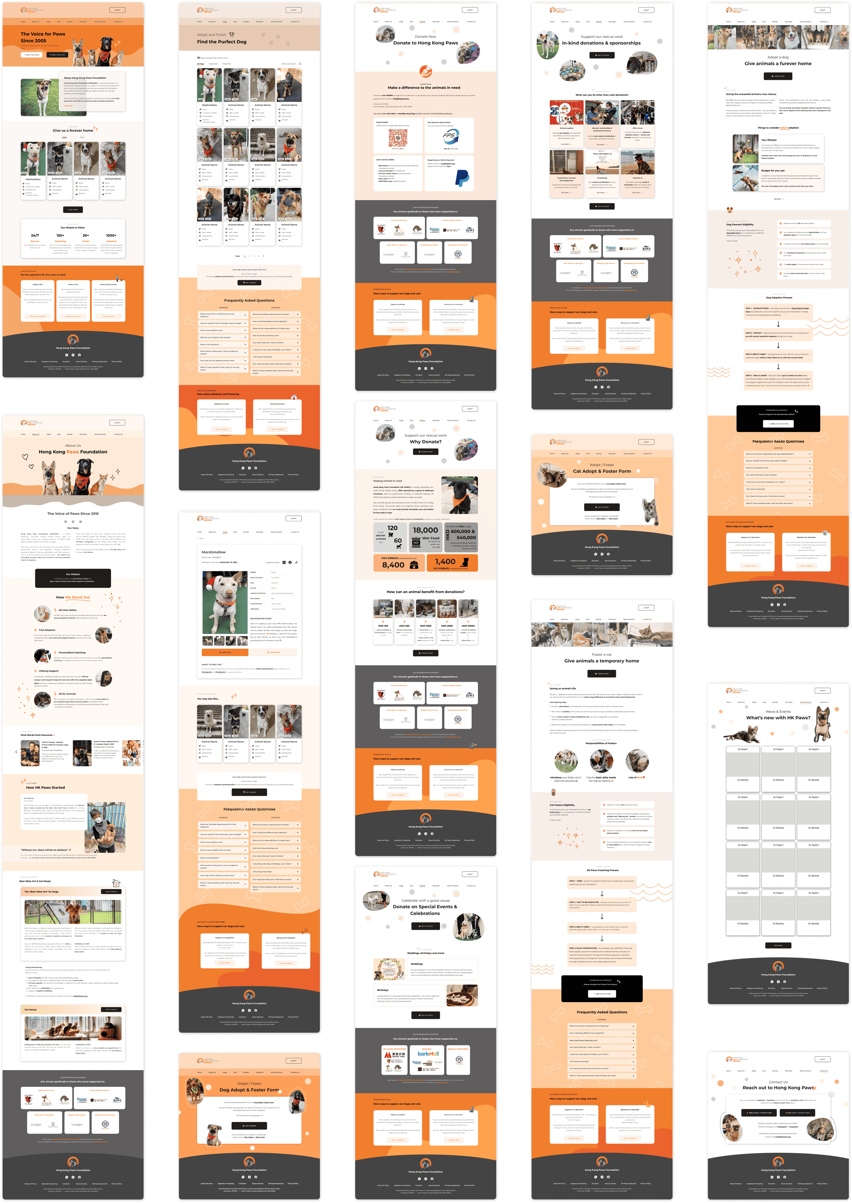
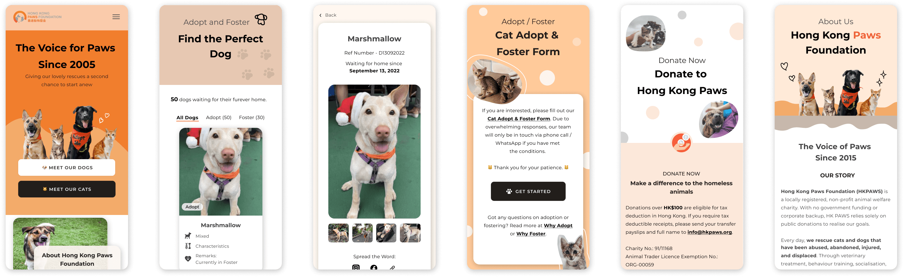
Responsive Mobile Web
I prioritized refining high-fidelity screens with revisions and concentrated on optimizing mobile responsiveness after client's approval and before handing off to web development.
I re-used the existing components from UI kit, shrunk them into smaller viewpoint and created mobile friendly webpage:
☝️ Click to view on Figma
What have I learnt?
Takeaways
