


The Research
Finding the right problems
What are the other animal shelters doing?
Competitive Analysis
Following discussions with key stakeholders, I executed a detailed analysis of competitors and supplementary studies to grasp the dynamic of Hong Kong's animal shelters.


I have also conducted competitive analysis and supplementary researches to understand the background of Hong Kong animal welfare field and the strategies they are using to draw in more prospective adopters and contributors.


Picking Users' Brain with User Interviews
Seven actual or potential adopters have been interviewed such that I could properly understand wants and needs.
What do we need to know?
These are the major questions I have carefully crafted to ensure in-depth and genuine outcome from the interivew:
The Concept
How to solve the well-defined problems?
Visualising Potential Adopters and Donors
Using the insights gathered from research and interviews, I have created three personas that vividly illustrate the backgrounds, needs, and pain points of potential adopters:


Turning Insights into Opportunities
After defining our user personas, I have created four HMW questions and reframed insights into opportunity areas and innovate on problems found during user research,
How might we increase adoptions, fostering, and donation ?
How might we increase people’s affection to animal who needs home?
How might we increase credibility of the animal shelter?
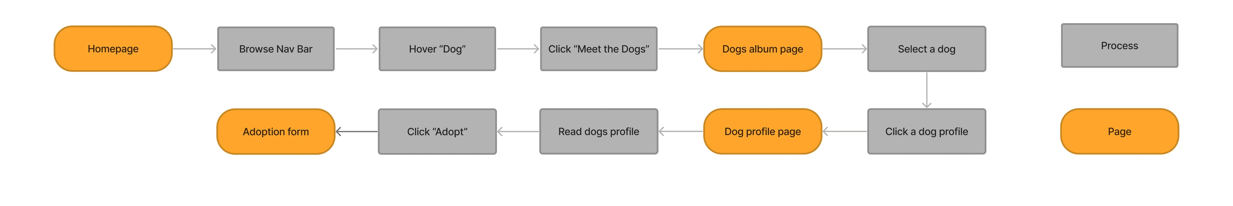
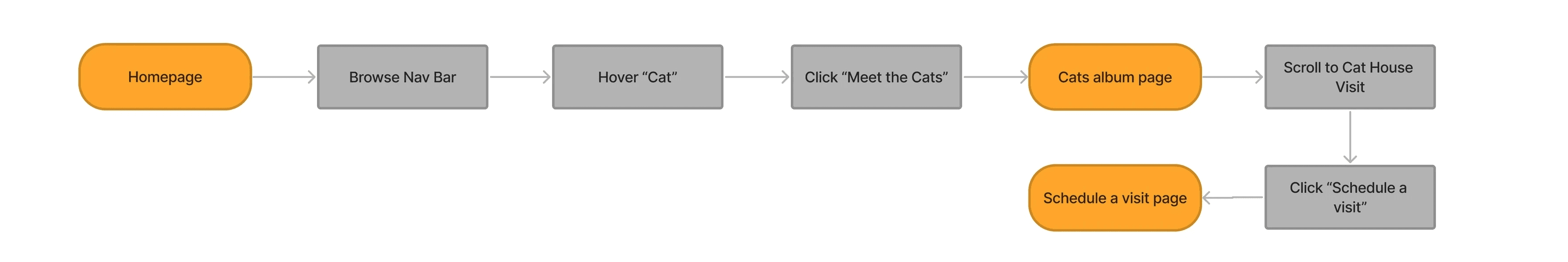
Mapping Users Mental Model By Task Flows
Based on the above sitemap, I have developed three task flows illustrating user's mental models when they are interacting with the website:
Flow 1: "Adopt a Dog"
This flow is designed for users interested in adopting a dog from HK Paws. Starting from the homepage, users will be directed to explore available dogs and ultimately fill out an adoption form for their chosen pet.
Task Flow
Legend
Flow 2: "Visit the Cat House"
This flow guides potential adopters or fosterers through the process of visiting the cat house at HK Paws. Given that HK Paws aims to minimize visits from the general public, the flow includes an explanation of visiting criteria and limits instead of a direct contact button.
The Design
How to visualise the solutions?
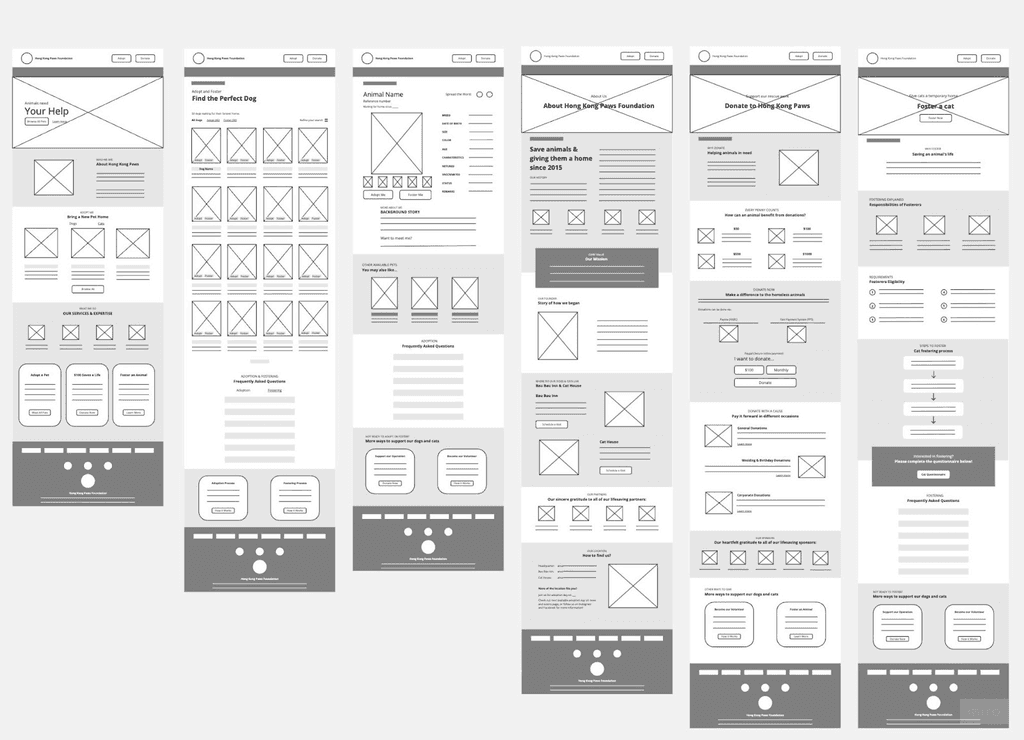
Designing Layout With Low /Mid-Fidelity Wireframes
After deciding on the website's navigation, I started creating basic wireframe sketches based on task flows I have previously crafted.
Initially, I used pen and paper, but my mentor and peers found it hard to follow my quick, slightly out of proportion drawings. So, I switched to digital sketches to present a clearer version to my mentor and stakeholders at HKPAWS.
Curating a UI Kit for Branding and Design Consistency
After presenting and receiving approval for the low-fidelity wireframes from the HK Paws team, we started to discuss the visual presentation of their new website. As they lacked a design system and had different designers working on their social media visuals without a unified style, I curated a UI Kit.
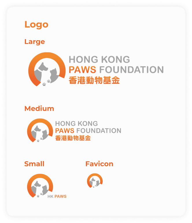
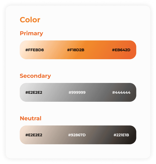
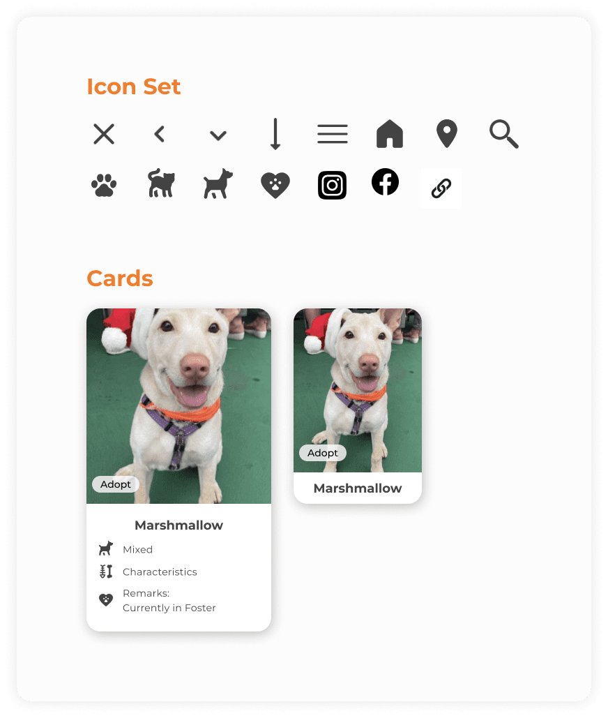
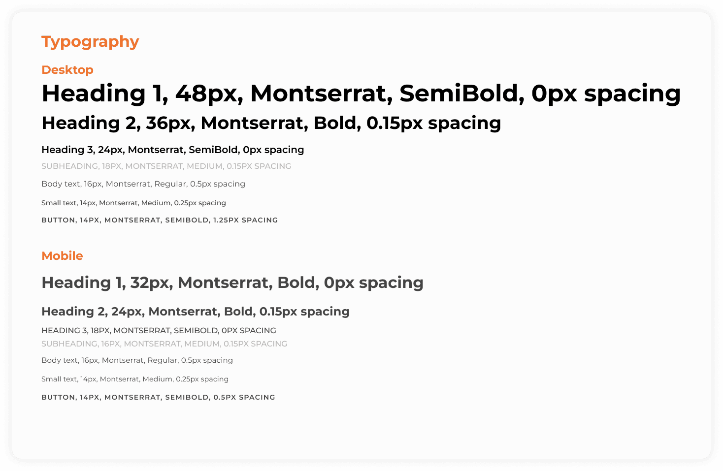
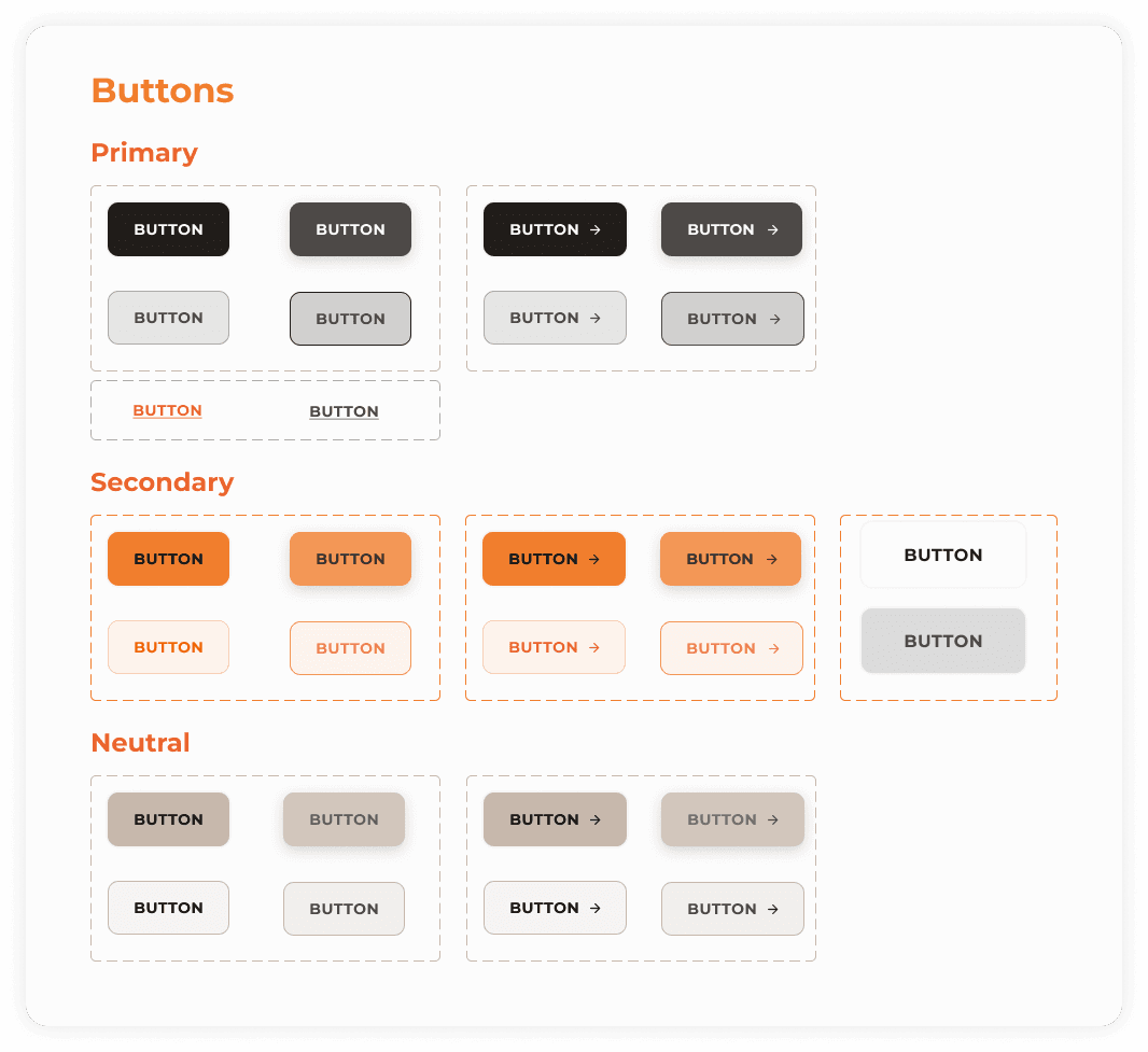
This kit was based on the client's desire to convey affection and care for their beloved cats and dogs, ensuring a consistent and cohesive visual identity for the high-fidelity wireframes.
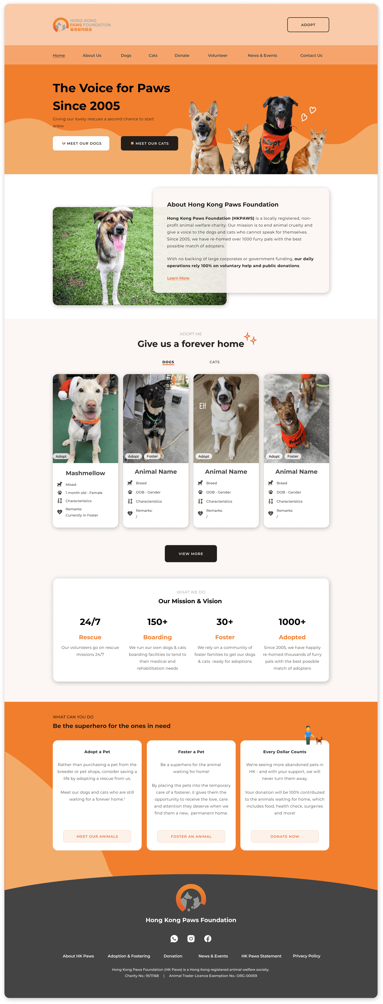
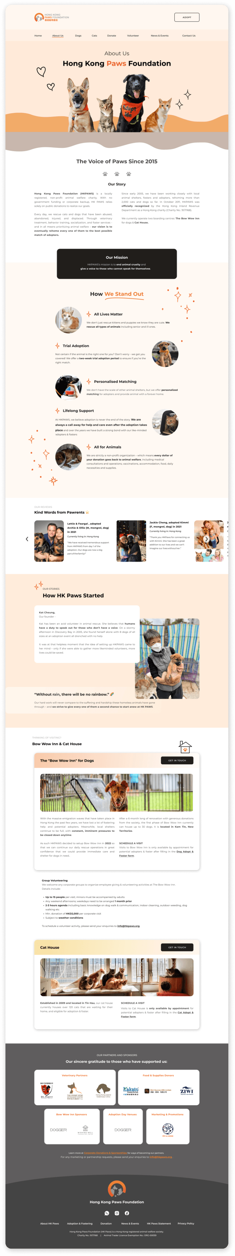
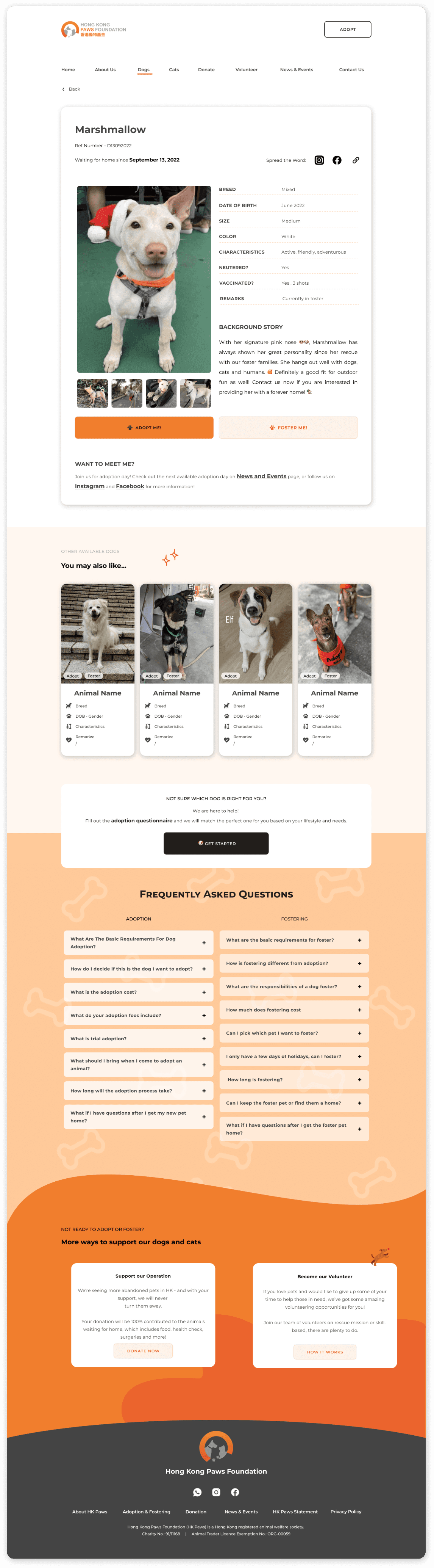
Injecting Brand Identity Into Wireframes
Once the UI kit was established, I began working on the high-fidelity wireframes. Taking into account the user interview findings, which emphasised a visual and story-telling first approach, I developed the wireframes accordingly.
Usability Testing
How to validate the design?
The purpose of usability testing is to assess participants' ability to follow task flows and complete them successfully, without any guidance or errors. Given the constraints of limited time and resources, I opted for unmoderated testing to gather valuable insights efficiently. Here are the key details of the test:
Date: 10-19 June 2023
Tools: Maze, Figma
Participants: 21 individuals aged between 20 and 40 years, who are interested in dog and cat adoption or have already adopted at least one dog or cat.
The Iterations
How to improve the design with qualitative data?
Taking the bugs & issues from usability testing into consideration, actionable items have been created and several iterations were made:
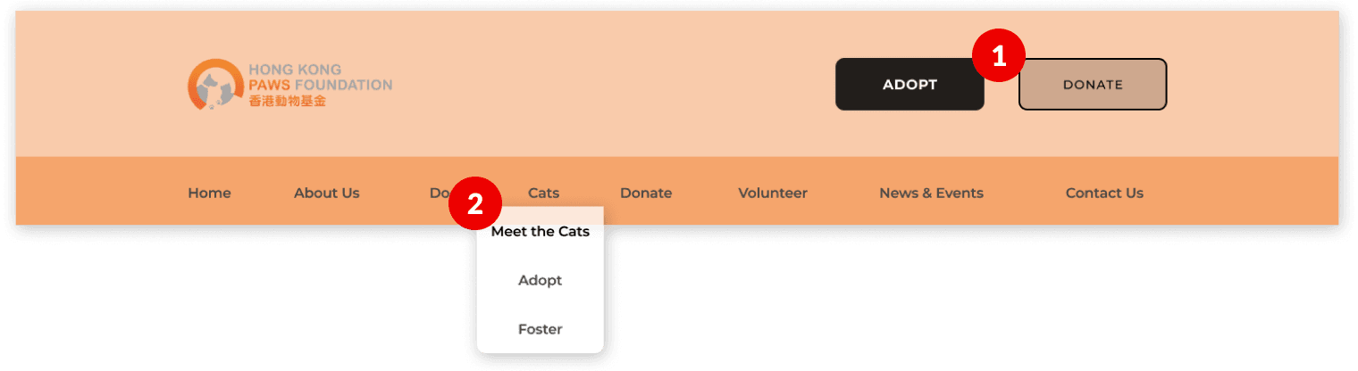
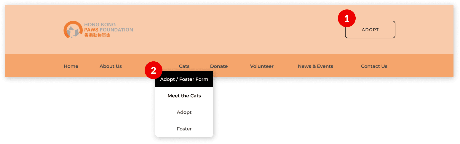
Homepage
✘ Problems
Too many CTA buttons .
Adopt/foster form should be easier to be reached.
✔ Improvement Made
Removed a CTA button and prioritising adoption.
Added a adopt/foster form under Dogs and Cats for visibility and accessibility.
Before
After
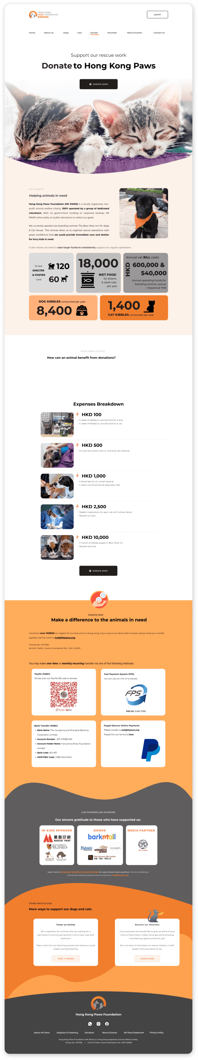
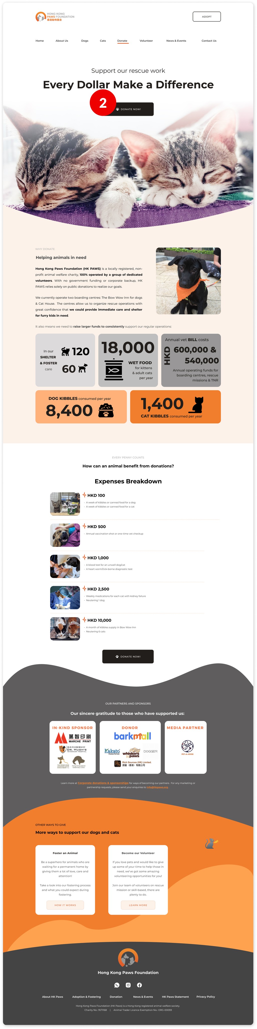
Donation Page
✘ Problems
Donation methods should be more apparent and quicker to be found.
Donation methods should be more distinct from one another.
✔ Improvement Made
Divided donate content into 2 pages: Donate Now & Why Donate.
Added Donate Now button on Why Donate hero image.
Before
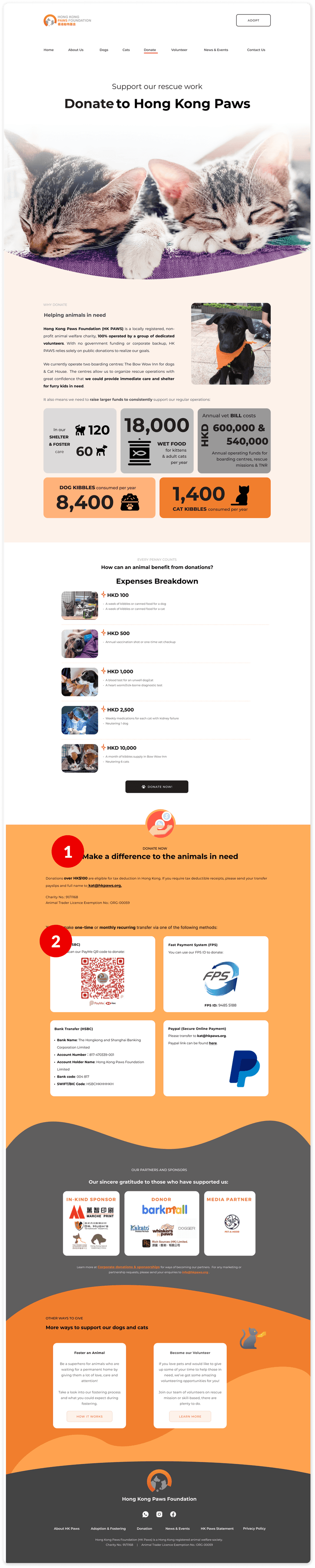
After
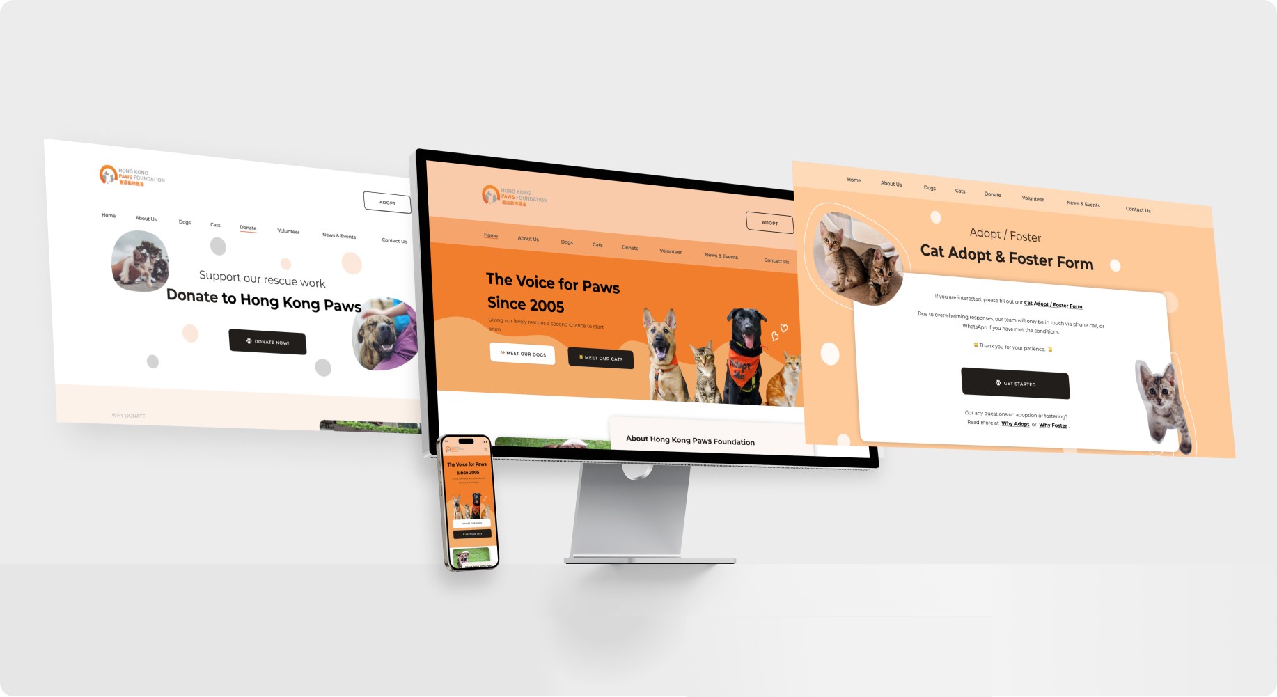
The Product
How does the MVP look like?
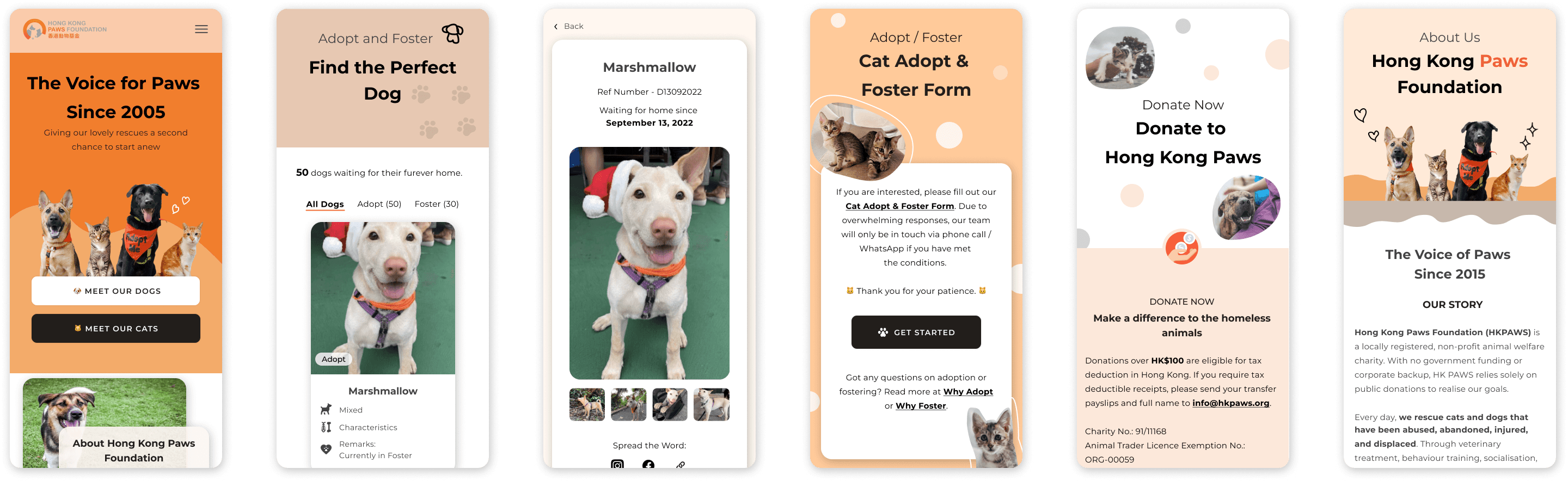
Responsive Mobile Web
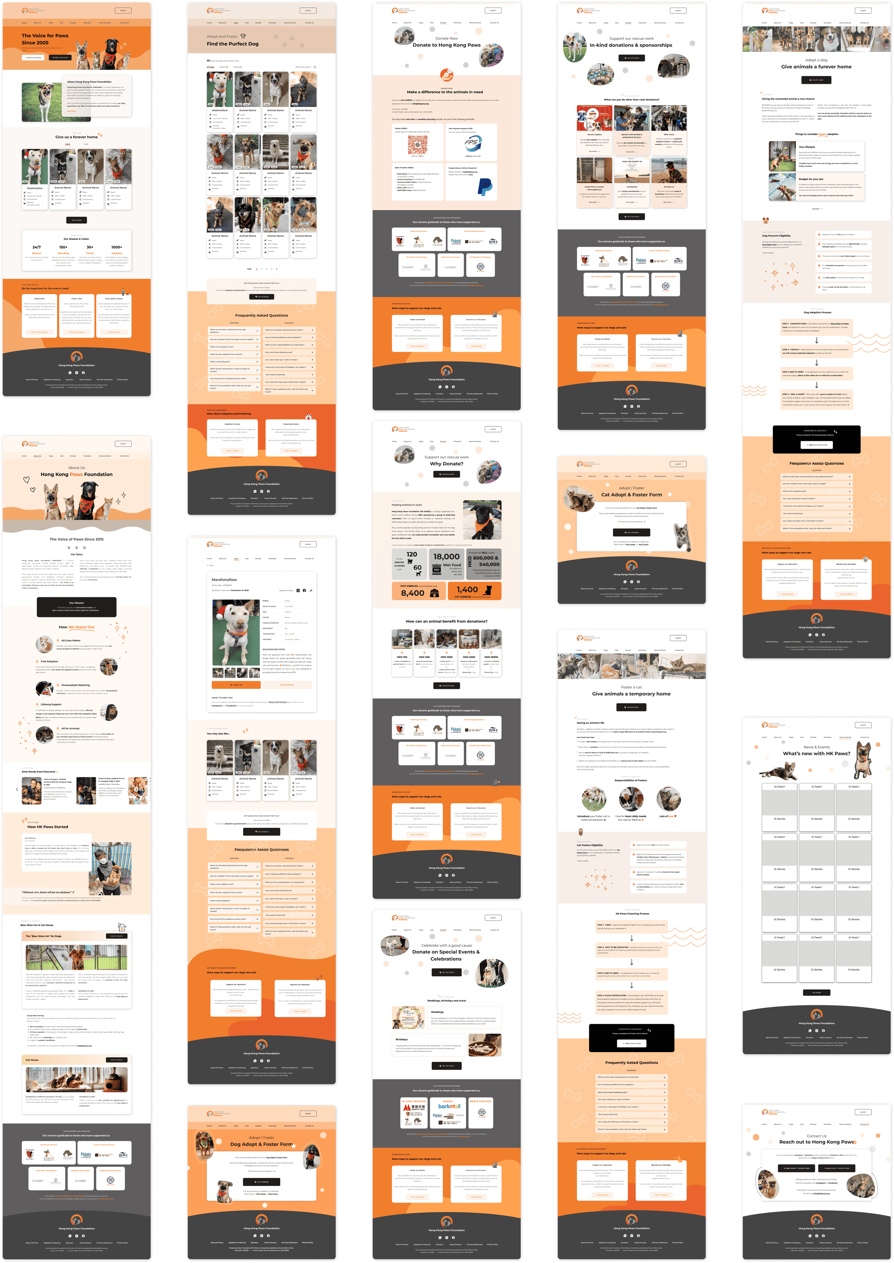
I prioritized refining high-fidelity screens with revisions and concentrated on optimizing mobile responsiveness after client's approval and before handing off to web development.
I re-used the existing components from UI kit, shrunk them into smaller viewpoint and created mobile friendly webpage:
☝️ Click to view on Figma