
Uber Eats
App, Product Design, Proof of Concept
2023
2 weeks
Uber Eats
App, Product Design, Proof of Concept
2023
2 weeks
Uber Eats
App, Product Design, Proof of Concept
2023
2 weeks
Uber Eats
App, Product Design, Proof of Concept
2023
2 weeks
Jump ahead to

📋 Project Overview
Uber Eats is an online food ordering and delivery platform launched by Uber in 2014. Meals are delivered by couriers using cars, scooters, bikes, or on foot. In July 2020 when pandemic hit, Uber Eats launched grocery delivery on Uber Eats to address the no-contact experience which many customers wished for.
Background
The Challenge
"How can Uber Eats groceries stand out from its competitors?"
Online groceries ordering is a very competitive market which requires stand out features. Now that the pandemic is “over '', fewer people require no-contact experience, which Uber Eats groceries was originally developed for.
As a later joiner in the market with a premium-priced model, Uber Eats needs to find ways to stand out from its competitors.
The Solution
"Premium-priced groceries delivery where users find rare food and groceries - UberEats International Store"
" premium-priced groceries delivery where users find rare food and groceries - Uber Eats International Store ".
Uber Eats is portrayed as a premium priced groceries delivery app. To stand out from other groceries delivery apps in this competitive market, while satisfying users' wishes for specialised food and ingredients, I would like to introduce a new feature for Uber Eats groceries function - Uber Eats International Store - selling groceries imported from different countries.
Uber Eats is portrayed as a premium priced groceries delivery app. To stand out from other groceries delivery apps in this competitive market, while satisfying users' wishes for specialised food and ingredients, I would like to introduce a new feature for Uber Eats groceries function - Uber Eats International Store - selling groceries imported from different countries.
The Research
Gaining objective & subjective insights
Secondary Research
I initiated this project by conducting secondary research - to learn when and how Uber Eats groceries was launched, where it stands and what are the challenges they are facing.
Here are the key insights:
I initiated this project by conducting secondary research - to learn Uber Eats groceries background, where it stands and what are the challenges they are facing.
lead to a 30% surge in new users for Uber Eats, leveraging it as Uber's revenue source.
returned to become the most profitable arm after the pandemic was over.
returned to become the most profitable arm of Uber Group after pandemic was over.
Uber Eats facing includes intense competitions, increased in gas and fuel price and non-brand loyal users.


Competitive Analysis
Competitive analysis has also been done to understand how competitors work and what are the differences between online delivery apps.
Competitive analysis has also been done to understand how competitors work and differences between online delivery apps.
Organisation
Uber Eats

Foodpanda

DoorDash

Deliveroo

Mission Statement
“Make eating well effortless at any time, for anyone.”
“Whether it's our users, restaurants, riders, or pandas, we believe that the key to keeping them with us is to continuously wow them with magical experiences.e”
“Growing and empowering a more diverse and inclusive community.”
“Build the definitive online food company. To be the platform that people turn to whenever they think about food. Getting food right online is hard.”
International
Availability
Available in over 6000 cities across 45 countries worldwide and continues to expand its outreach.
Operates in 13 markets in Asia and four markets in Europe
Operates in over 7,000 cities across the United States, Canada, Australia, and Japan
Operates in 12 countries, mostly in Western Europe, Hong Kong and Middle East
Target Market
Worldwide, between 25 to 44 years old
Locals and expats, knowledgeable, couples and families
People who already have a pet/ who are opting for convenience
Younger local and expats, mostly couples and families
Pricing Model
Uber Eats charges a commission on each order, typically around 20-30%.
The commission is generally between 15% and 25% inclusive of all taxes.
20%, 25% or 29% delivery commission based on varying levels of built-in marketing, and $9.99 on customer as delivery fee
Deliveroo takes anywhere between 25 to 45 percent commission on every sale.
Bundling
Services
Uber food delivery, Uber ride, Uber package delivery
FoodPanda food and groceries delivery service, Foodpanda package delivery
DoorDash food and groceries delivery service, convenience store delivery
Deliveroo food delivery, Deliveroo Editions ghost kitchen, Deliveroo HOP (delivery-only grocery stores)
Features
Instant
Delivery
Groceries
Delivery
Delivered
by Recipe
Item
Descriptions
Item
Descriptions
Search
Usability
Moderate
Good
Good
Moderate
Strengths & Weaknesses
Strengths
Brand recognition
Extensive network
Technology infrastructure
Diverse revenue streams
Real-time data analytics
Flexibility for delivery partners
User-friendly platform
Brand Recognition
Global market
Customer support
Fast delivery
Location intelligence technology
Large and growing market
Wide range of restaurant partnershipsAdvanced logistics technology
Strong brand recognition
Diversification of services
Brand recognition
Affordability
Technological innovation
Geographical diversification
Quick adaptability
Dark Kitchens (Deliveroo Editions)
Weaknesses
Dependence on independent contractors on delivery
Poor restaurant and shop relations due to high fees
Dependence on user ratings
Legal, regulatory Challenges
Sustainability concerns
Can only order in the proximity
Costly delivery due to intense promotion to customers
Limited geographical presence
High competition
Dependence on technological infrastructure
Sustainability concerns
Dependence on third-party delivery drivers
Intense competition
Reliance on restaurant partnerships
High operating costs
Limited geographical presence
Dependence on “riders”
Low profitability like many tech-driven delivery services
Intense competition
Market penetration
Regulatory challenges
Customer retention
Organisation
Uber Eats
Foodpanda
DoorDash
Deliveroo
Mission Statement
“Make eating well effortless at any time, for anyone.”
“Whether it's our users, restaurants, riders, or pandas, we believe that the key to keeping them with us is to continuously wow them with magical experiences.e”
“Growing and empowering a more diverse and inclusive community.”
“Build the definitive online food company. To be the platform that people turn to whenever they think about food. Getting food right online is hard.”
International
Availability
Available in over 6000 cities across 45 countries worldwide and continues to expand its outreach.
Operates in 13 markets in Asia and four markets in Europe
Operates in over 7,000 cities across the United States, Canada, Australia, and Japan
Operates in 12 countries, mostly in Western Europe, Hong Kong and Middle East
Target Market
Worldwide, between 25 to 44 years old
Locals and expats, knowledgeable, couples and families
People who already have a pet/ who are opting for convenience
Younger local and expats, mostly couples and families
Pricing Model
Uber Eats charges a commission on each order, typically around 20-30%.
The commission is generally between 15% and 25% inclusive of all taxes.
20%, 25% or 29% delivery commission based on varying levels of built-in marketing, and $9.99 on customer as delivery fee
Deliveroo takes anywhere between 25 to 45 percent commission on every sale.
Bundling
Services
Uber food delivery, Uber ride, Uber package delivery
FoodPanda food and groceries delivery service, Foodpanda package delivery
DoorDash food and groceries delivery service, convenience store delivery
Deliveroo food delivery, Deliveroo Editions ghost kitchen, Deliveroo HOP (delivery-only grocery stores)
Features
Instant
Delivery
Groceries
Delivery
Delivered
by Recipe
Item
Descriptions
Item
Descriptions
Search
Usability
Moderate
Good
Good
Moderate
Strengths & Weaknesses
Strengths
Brand recognition
Extensive network
Technology infrastructure
Diverse revenue streams
Real-time data analytics
Flexibility for delivery partners
User-friendly platform
Brand Recognition
Global market
Customer support
Fast delivery
Location intelligence technology
Large and growing market
Wide range of restaurant partnershipsAdvanced logistics technology
Strong brand recognition
Diversification of services
Brand recognition
Affordability
Technological innovation
Geographical diversification
Quick adaptability
Dark Kitchens (Deliveroo Editions)
Weaknesses
Dependence on independent contractors on delivery
Poor restaurant and shop relations due to high fees
Dependence on user ratings
Legal, regulatory Challenges
Sustainability concerns
Can only order in the proximity
Costly delivery due to intense promotion to customers
Limited geographical presence
High competition
Dependence on technological infrastructure
Sustainability concerns
Dependence on third-party delivery drivers
Intense competition
Reliance on restaurant partnerships
High operating costs
Limited geographical presence
Dependence on “riders”
Low profitability like many tech-driven delivery services
Intense competition
Market penetration
Regulatory challenges
Customer retention
Survey for Quantitative Data
Uber Eats enjoys vast international presence, boasting a surplus of tools to compile vital numerical data - collecting information via questionnaires is a method to capture concrete figures on individuals' attitudes and actions that can shape crucial choices.
I developed a survey aiming at both those who favor online grocery shopping and those who do not. The findings are presented below:
Survey result link can be found here.


User Interviews for Qualitative Data
Simultaneously, I have conducted user interviews for qualitative data on groceries shoppers online and offline experiences, their needs and pain points.
I have recruited 7 participants for a user interview, and they are all located where UberEats operates, have shopped online and offline previously and heard of Uber Eats.
These are the key findings from survey and after the user interview was completed and transcripts were synthesised through affinity mapping:

Budget and Nutrition Concerns
Despite od the busy schdule people have in mordern morld today, many prefer cooking for its nutrition and cost advantages.

Factors Influencing Home Cooking Choices
People consider factors like store proximity, product variety, price, and discounts available before starting their culinary journey.

Online Grocery Shopping Surge
Online grocery shopping soaredduring pandemic; however some still prefers physical stores due to prices and food freshness.

Specialised Food Draws Online Shoppers
Specialised platforms catering to unique food needs attract customers seeking items not commonly found in traditional stores.
Brand Loyalty and Shopper Satisfaction
With dissatisfaction arising from high prices, service delays, and out-of-stock items, users often explore other platforms offering better deals.
UberEats' Challenge
UberEats faces stiff competition in the grocery delivery market. Gaining and retaining users base is a challenge, given perceptions of high costs and delivery fees.
Define & Refine
Turning insights into concepts
Personas
I have created two personas that illustrate the backgrounds, needs, and pain points of grocery shoppers, with the insights gathered from research and interviews.


" I shop online for specialised food products - especially those ingredients I am unable to find easily in local supermarkets."
- Kristy, 27, Asian living in the US.
" I shop online for specialised food products - especially those ingredients I am unable to find easily in local supermarkets."
- Kristy, 27, Asian living in the US.
Task Flows
Based on the personas above and current tasks flows from groceries function on Uber Eats app, I have developed three two flows illustrating the proposed new feature - Uber Eats International:
Based on the personas above and current tasks flows from groceries function on Uber Eats app, I have developed three two flows illustrating the proposed new feature - Uber Eats International:

The Design
From concept to wireframing
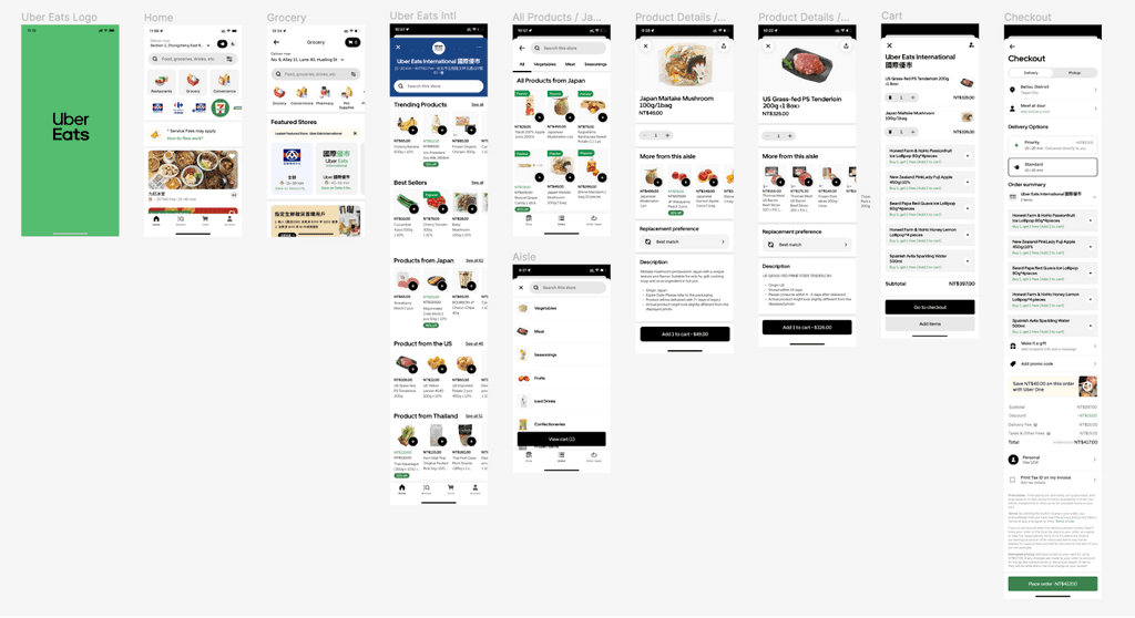
High-Fidelity Wireframes
Since Uber Eats design system is very well established with ample UI design resources found online, I decided to follow their guidelines and current Uber Eats groceries app, took a leap and created high-fidelity wireframes based on the above task flows:
☝️ Click to view on Figma
Usability Testing
Validating the solutions
Moderated Usability Testing
After high-fidelity version 1 is completed, I have created a prototype for usability testing. I would like to examine participants' ability to complete shopping without any mistakes and errors, and to check their impression towards.
Given the constraints of limited time and resources, I opted for unmoderated testing to gather valuable insights efficiently.
After high-fidelity version 1 is completed, I have created a prototype for disability testing. I would like to examine participants' ability to complete shopping without any mistakes and errors, and to check their impression towards.
Given the constraints of limited time and resources, I opted for unmoderated testing to gather valuable insights efficiently.
Date: 25 - 27 July 2023
Tools: Google Meet (and Awesome Screenshots for video recording), Figma
Participants: 5 individuals aged between 20 and 40 years, who are frequent online grocery shoppers
Results and Key Insights
Affinity Mapping was used to synthesis the usability testing results and here are the key insights:
Affinity Mapping was used to synthesis the usability testing results and here are the key insights:
5 of 5
Successfully completed the tasks of buying mushrooms from Japan and steak from the US
Found product details page - “more from the aisle” section should be placed further at the bottom
2 of 5
Wished to be directed to Uber Eats International right away after navigating from notification
Found grocery button is shown again on the page after clicking grocery button is strange
Found Uber in Chinese is too big and the English word “international” is too difficult to be seen
1 of 5
Thought add-on items were cart items
Found there were too many add-on items
Wished to see Korean products approximate to Japanese products
Wished to see more photos of a product
Iterations
Solving usability issues via iterations
Taking the key findings from usability testing into consideration, several iterations were made:
Product Page
One major iteration made based on feedback from usability testers was where the product description section was located.
100% participants indicated that they are not comfortable having product description at the bottom of the page (as of July 23, 2023), instead of the product photos.
Product information is especially important when it comes to premium products, of which people want to know more before purchasing.

☝️ Click to view on Figma
Product Page
One major iteration made based on feedback from usability testers was where the product description section was located.
100% participants indicated that they are not comfortable having product description at the bottom of the page (as of July 23, 2023), instead of the product photos.
Product information is especially important when it comes to premium products, of which people want to know more before purchasing.
☝️ Click to view on Figma
Grocery Page
Once the user clicked the “Grocery” button on the homepage, another “Grocery” button was displayed (see photo on the left).

☝️ Click to view on Figma
Users found it confusing as the button appeared again. To eliminate users’ confusion, I decided to change “Grocery” label to “All Stores” label.
Grocery Page
Once the user clicked the “Grocery” button on the homepage, another “Grocery” button was displayed (see photo on the left).
☝️ Click to view on Figma
Users found it confusing as the button appeared again. To eliminate users’ confusion, I decided to change “Grocery” label to “All Stores” label.
And…
Uber Eats International
One major iteration made based on feedback from usability testers was where the product description section was located.
Users found it confusing as the button appeared again. To eliminate users’ confusion, I decided to change “Grocery” label to “All Stores” label.

☝️ Click to view on Figma
Uber Eats International
One major iteration made based on feedback from usability testers was where the product description section was located.
Users found it confusing as the button appeared again. To eliminate users’ confusion, I decided to change “Grocery” label to “All Stores” label.
☝️ Click to view on Figma
Uber Eats International (Cont'd)

☝️ Click to view on Figma
In addition, I have changed products from “Trending Products” and “Bestseller” into more premium items to attract eyeballs. Also, delivery fee has been highlighted as this is one of the major information for users
Uber Eats International (Cont'd)
☝️ Click to view on Figma
In addition, I have changed products from “Trending Products” and “Bestseller” into more premium items to attract eyeballs. Also, delivery fee has been highlighted as this is one of the major information for users
Cart Page
Users have cited their concerns with add-on items. They were not sure if the products were already included in cart or add-on items.
I have added a title “Add-on discounts” for add-on items, to prevent confusion users might have between cart items and available add-on items.

☝️ Click to view on Figma
Cart Page
Users have cited their concerns with add-on items. They were not sure if the products were already included in cart or add-on items.
I have added a title “Add-on discounts” for add-on items, to prevent confusion users might have between cart items and available add-on items.
☝️ Click to view on Figma
The Prototpye

Takeaways & Next Steps
Key Takeaways
✅ When the test results go south, go south with the users
My initial thought for feature adding was a recipe based shopping; yet according to the survey results, it seems that very few users are interested in this function. Hence I aborted this thought and ideated again for multiple new ideas.
After a few quick follow-up surveys, I have decided to move forward and testers from usability testing have given positive feedback towards Uber Eats International.
✅ Follow a design system
With a mature Uber Eats design system, wireframes could be created easily as color, fonts, sizings and spaces can be followed according to the guideline. My final product looked as if it is a native feature on the actual app, and it could not be cohesive without a design system.
Next Steps
👣 Version 2 (v2) testing
I do not have a chance yet to test the final prototype after iteration. If there is more time and resources moving forwards, I would like to test Uber Eats International v2 and gather more feedback from potential users.
👣 New features opportunities, based on usability testing feedback
There are a few interesting ideas coming from testers, which includes merchant and product reviews, country tags for quick access and delivery fee displays. I would like to further develop Uber Eats grocery with these ideas, and keep improving the Uber Eats app.